
Choosing the right paint colors for your home can feel overwhelming. With thousands of shades available across Benjamin Moore, Sherwin-Williams, and PPG alone, how do you know which one will look best in your St. Catharines home? The wrong color choice is one of the most common — and costly — mistakes homeowners make, leading to repaints within a year. At Qpaintings, we help St. Catharines homeowners make confident, lasting color decisions every day. Here’s exactly how to do it right.

1. Start with Natural Light — the Most Important Factor
Before you pick a single color, understand how natural light behaves in each room. The same paint color can look completely different depending on which direction your windows face — and St. Catharines homes vary significantly in light exposure depending on the neighborhood and lot orientation.
- North-facing rooms receive cool, indirect light throughout the day. These rooms benefit from warm shades — creamy whites, soft beige, golden yellow, or warm greige — which counteract the coolness and prevent the room from feeling dim or cold.
- South-facing rooms are naturally bright and warm. They can handle cooler shades — light blues, soft grays, or crisp whites — without feeling sterile, because the light warms them up naturally.
- East-facing rooms get strong morning sun and softer afternoon light. Warm or neutral tones work well and avoid the washed-out look that can happen with too much cool color in morning light.
- West-facing rooms are dim in the morning but glow golden in late afternoon. Medium-tone warm neutrals or earthy colors respond beautifully to that evening light.
Pro tip: Always observe your paint sample at multiple times of day — morning, midday, and evening — before committing. Light changes more than most homeowners realize between 9 AM and 6 PM.
2. Match Paint Colors to Room Function
Color psychology is a real factor in how a space feels to live in. Certain colors are proven to affect mood, energy, and even perceived room size. Here’s a room-by-room guide for interior paint colors in St. Catharines homes:
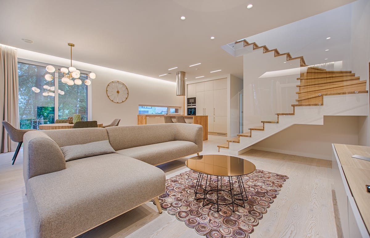
- Living rooms: Warm neutrals — greige, warm white, soft taupe — create welcoming, versatile spaces that work with most furniture. Benjamin Moore’s Simply White and Pale Oak are consistently top sellers for St. Catharines living rooms.
- Bedrooms: Soft blues, sage greens, and muted lavender promote relaxation and lower stress. Avoid strong saturated colors which can feel energizing rather than restful.
- Kitchens: Bright whites, soft off-whites, and light grays feel clean, open, and timeless. These also coordinate well with most cabinet colors — especially if you’re considering cabinet painting in St. Catharines.
- Bathrooms: Cool whites, soft blue-greens, and light aquas create a clean, spa-like feel. These shades also make small bathrooms feel larger.
- Home offices: Light green, soft blue, or warm white improves focus and reduces eye fatigue over long working hours. Avoid strong accent colors which can become distracting.
- Dining rooms: Deep, rich tones — navy, forest green, burgundy — create an intimate, sophisticated atmosphere for entertaining.
3. Test Paint Samples Before Committing — Always
This is the step that saves homeowners from expensive repaints. Paint looks dramatically different on your wall than it does on a small color card under store lighting. The card is tiny, surrounded by white, and lit with commercial fluorescent light — none of which reflects how the color will actually look in your home.

The right way to test paint colors:
- Buy sample pots (most brands offer 250–500 mL testers) of your top 2–3 choices
- Paint a 12″×12″ patch on at least two different walls in the room — ideally one that gets direct light and one that doesn’t
- Observe the patches in morning, afternoon, and evening light, as well as under your artificial lighting
- Live with the samples for 2–3 days before deciding — colors often look different on day 3 than they did the first hour
- Always apply two coats of the sample — one coat never shows the true color
4. Use the 60-30-10 Color Rule for a Balanced Result
Interior designers rely on the 60-30-10 rule to create rooms that feel cohesive and visually balanced without looking flat. Here’s how it works:
- 60% — Dominant color (walls): Your main wall color sets the overall tone. This should be a neutral or mid-tone shade you’re comfortable with as the backdrop for everything else.
- 30% — Secondary color (large furniture, rugs, curtains): Sofas, area rugs, and window treatments. This color complements the wall color and adds depth.
- 10% — Accent color (pillows, art, accessories): The boldest, most personality-driven color in the room. Because it’s only 10%, you can take risks here without overwhelming the space.
For example: warm white walls (60%) + natural linen sofa and tan rug (30%) + terracotta or navy accent cushions and artwork (10%) = a timeless, designer-quality living room.
5. Consider How Colors Flow Between Rooms
In open-concept St. Catharines homes — where the kitchen, dining area, and living room are visible from one another — paint colors need to work as a connected palette, not as isolated choices. A jarring color transition between adjoining spaces makes a home feel choppy and smaller than it actually is.
Strategies for color flow:
- Use a consistent undertone across all open-plan spaces (all warm, or all cool — not mixed)
- Select colors from the same paint brand’s coordinated palette
- Use your accent color in one room as the secondary color in the next — this creates a natural visual connection
- Reserve bold or saturated colors for enclosed rooms (bedrooms, powder rooms) where they won’t compete with adjacent spaces
Our interior painting team in St. Catharines maps out whole-home color schemes during consultations to ensure everything connects beautifully from room to room.
6. Don’t Forget Ceilings, Trim, and Doors
Wall color is only part of the picture. Ceilings, trim, baseboards, and doors all interact with your wall color and dramatically affect the final result:
- Ceilings: Pure bright white makes ceilings feel higher and more expansive. A ceiling painted the same color as the walls (in a slightly lighter shade) creates a cozy, enveloping effect popular in bedrooms and dining rooms.
- Trim and baseboards: Crisp white or off-white trim frames wall colors and adds a clean, finished look. Consider our trim painting service in St. Catharines to complete the look professionally.
- Interior doors: Painting doors a darker accent color (charcoal, navy, black) is one of the most impactful — and affordable — design upgrades available. Our door painting service handles this quickly and cleanly.
Most Popular Paint Colors for St. Catharines Homes in 2026
Based on the projects we complete across St. Catharines and the Niagara region, these are the most requested colors right now:
- Benjamin Moore Chantilly Lace (OC-65) — the go-to crisp white for kitchens and trim
- Benjamin Moore Pale Oak (OC-20) — warm greige perfect for living rooms and hallways
- Sherwin-Williams Agreeable Gray (SW 7029) — the most popular neutral in North America for good reason
- Benjamin Moore Hale Navy (HC-154) — trending for accent walls, cabinets, and front doors
- Sherwin-Williams Sage (SW 0017) — soft earthy green gaining fast popularity in bedrooms and offices
Frequently Asked Questions About Paint Color Selection
What is the most popular interior paint color in 2026?
Warm whites, soft greiges, and earthy sage greens are dominating in 2026. Benjamin Moore’s Pale Oak and Sherwin-Williams’ Agreeable Gray remain perennial top sellers, while nature-inspired tones like warm terracotta and soft olive are gaining ground in accent applications.
How many paint colors should I use in my home?
For a cohesive whole-home palette, most designers recommend 3–5 colors: one dominant neutral used across most spaces, one or two complementary tones for variety, and one or two accent colors used sparingly in specific rooms or on trim and doors.
Should walls be lighter or darker than furniture?
In most cases, walls benefit from being lighter than large furniture pieces — this creates depth and makes the furniture feel anchored rather than floating. The exception is intentional moody or dramatic rooms where dark walls are the design goal.
Do I need a professional color consultation?
If you’re painting multiple rooms or making a significant change, professional consultation is worth it. Qpaintings offers free color consultation with every painting estimate — our team helps you choose colors that work with your light, flooring, and existing furnishings before any paint is purchased.
Get Expert Color Guidance — Free with Every Qpaintings Estimate
You don’t have to guess. Qpaintings provides free, in-home or virtual color consultation with every project estimate in St. Catharines and the Niagara region. Our team helps you build a whole-home palette that works with your natural light,